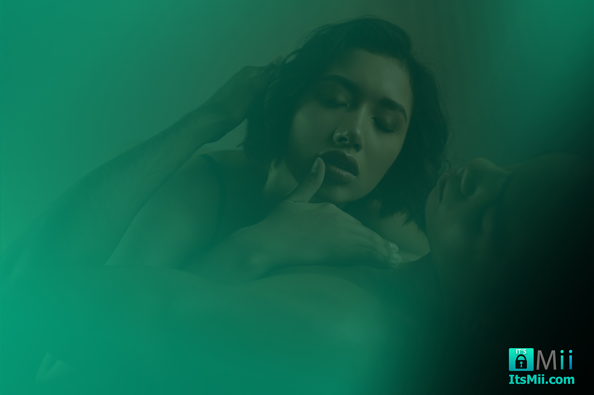
The colors that surround us do more than please the eye—they speak directly to our emotions, influencing our mood, behavior, and even physical reactions. From the calming blue of a bedroom to the energizing red of a restaurant logo, color psychology reveals how different hues can transform our emotional landscape. This fascinating intersection between visual perception and emotional response has implications for everything from marketing to mental health.
The Science Behind Color and Emotion
Our relationship with color begins at a neurological level. When light enters our eyes, it triggers a cascade of reactions that eventually reach the hypothalamus—a brain region that regulates hormones and many of our basic bodily functions. Different wavelengths of light (colors) can stimulate different neurological and hormonal responses, explaining why certain colors consistently evoke particular emotions across cultures.
Research in color psychology has demonstrated that these responses aren’t merely subjective—they manifest in measurable physiological changes including shifts in blood pressure, eye strain, and even hunger levels.
Primary Colors and Their Emotional Signatures
Red: The Color of Intensity
Red demands attention. As the longest visible wavelength, it appears to advance toward us visually, creating a sense of proximity and urgency. This powerful hue is associated with:
– Passion and romantic love
– Excitement and energy
– Anger and danger
– Hunger and impulsivity
Studies show that exposure to red can actually raise blood pressure and increase respiration rate, making it a truly “activating” color.
Blue: The Wavelength of Tranquility
Blue exists on the opposite end of the emotional spectrum. This shorter wavelength color recedes visually, creating a sense of space and calm. Blue environments tend to evoke:
– Serenity and relaxation
– Trust and dependability
– Focus and productivity
– Sadness (in certain contexts)
Exposure to blue has been shown to lower blood pressure and heart rate—one reason why it’s frequently used in healthcare settings and meditation spaces.
Yellow: The Sunshine Hue
Yellow captures the brightness of sunlight and tends to provoke:
– Happiness and optimism
– Mental stimulation
– Caution or anxiety (in excess)
– Enhanced concentration
Yellow stimulates the production of serotonin, potentially contributing to its mood-lifting effects.
Secondary Colors and Complex Emotions
Green: Nature’s Neutral
Sitting at the center of the visible spectrum, green requires minimal eye adjustment, creating a sense of balance and ease. Green spaces and objects promote:
– Harmony and restoration
– Growth and renewal
– Safety and permission
– Environmental consciousness
Studies have shown that even brief exposure to green environments can reduce stress and mental fatigue.
Purple: The Royal Blend
Combining the stability of blue with the energy of red, purple creates a complex emotional palette:
– Creativity and imagination
– Luxury and sophistication
– Spirituality and mystery
– Introspection and contemplation
Historically reserved for royalty due to the rarity of purple dye, this color retains associations with prestige and uniqueness.
Orange: Social Energy
Blending red’s intensity with yellow’s cheerfulness, orange tends to evoke:
– Enthusiasm and extroversion
– Warmth and comfort
– Affordability and accessibility
– Appetite stimulation
This explains why orange is a favorite for social spaces and food establishments.
Color Palettes and Emotional Landscapes
While individual colors have distinct emotional associations, their combinations create more nuanced emotional environments. Consider these common palettes:
Monochromatic Palettes** (variations of a single hue) create cohesive, harmonious emotional experiences, often conveying sophistication and thoughtfulness.
Complementary Palettes** (colors opposite on the color wheel) generate visual tension and energy, stimulating engagement and creating memorable emotional impressions.
Analogous Palettes** (colors adjacent on the color wheel) produce comfortable, unified emotional experiences without jarring transitions.
## Using Color for Emotional Well-being
Understanding color psychology enables us to intentionally shape our emotional environments:
1. For stress reduction, incorporate blues and greens into spaces where you need to relax or focus deeply.
2. To boost energy and creativity, introduce measured amounts of red, orange, or yellow into workspaces or creative studios.
3. For balanced social environments, consider palettes combining warm and cool colors to simultaneously energize and comfort.
4. To manage seasonal mood fluctuations, adjust your color environment seasonally—warming up spaces during dark winter months with amber lighting and warm hues.
5. For digital well-being, use blue light filters on devices and surround your screens with calming colors to reduce eye strain and screen-induced anxiety.
Personal Color Connections
While color psychology offers general principles, individual experiences and cultural backgrounds influence our color-emotion associations. Take time to reflect on your personal color relationships:
– Which colors consistently lift your mood?
– Do certain hues trigger specific memories or emotions?
– How do cultural factors influence your color perceptions?
Keeping a simple color journal—noting your emotional responses to different environments—can reveal patterns that help you curate more emotionally supportive surroundings.
The Future of Color and Emotion
Emerging research in color psychology is exploring how dynamic color systems—like gradually changing lighting throughout the day—can support circadian rhythms and emotional regulation. Smart homes increasingly incorporate these principles, automatically adjusting color temperature to support natural energy patterns.
The colors that fill our world do more than decorate our surroundings—they actively shape our emotional experiences. By understanding these powerful connections between palette and feeling, we gain valuable tools for enhancing well-being, improving communication, and creating environments that support our emotional needs.
Whether you’re designing a workspace, choosing a wardrobe, or simply repainting a room, consider not just how a color looks, but how it makes you feel. In the palette of life, every color choice becomes an opportunity to nurture your emotional landscape.


